By me, someone who spent too long staring at paintings and needed to make sense of it.
TL;DR — Summary List
- Renaissance (roughly 1300–1600): order, balance, reason, human dignity, mathematical perspective, soft light. Think: calm, ideal, controlled.
- Baroque (roughly 1600–1750): drama, emotion, movement, darkness, theatricality, propaganda. Think: loud, urgent, overwhelming.
- Renaissance asked “what is beautiful?” Baroque asked “what do you feel?”
- Renaissance light is everywhere and even. Baroque light hits like a spotlight on a stage.
- Renaissance figures are idealized and still. Baroque figures are mid-action, caught in a moment.
- Renaissance backgrounds are fully developed. Baroque backgrounds often dissolve into darkness.
- The Catholic Church drove both — but in opposite directions. Renaissance was about dignity. Baroque was about persuasion after the Protestant Reformation rattled the Church’s grip.
- The key Renaissance technique is sfumato (Leonardo’s smoky soft transitions). The key Baroque technique is tenebrism (Caravaggio’s extreme spotlight-in-darkness).
Quick Reference Tables
Table 1: Side-by-Side at a Glance
| Feature | Renaissance | Baroque |
|---|---|---|
| Time period | ~1300–1600 | ~1600–1750 |
| Origin | Florence, Italy | Rome, Italy (then all of Europe) |
| Core value | Harmony, reason, ideal beauty | Drama, emotion, grandeur |
| Light | Soft, diffuse, uniform | Extreme contrast, single dramatic source |
| Composition | Balanced, symmetrical | Asymmetrical, diagonal, dynamic |
| Figures | Idealized, calm, still | Active, caught mid-motion, emotional |
| Background | Fully rendered landscape or architecture | Often dark, receding, or dissolved |
| Religious tone | Reverent, ordered, dignified | Overwhelming, designed to move you |
| Key technique | Sfumato, linear perspective, chiaroscuro | Tenebrism, extreme chiaroscuro |
| Key movement driver | Humanism, classical revival | Counter-Reformation, absolute monarchies |
Table 2: Artists and Representative Works
| Period | Artist | Key Work | What It Shows |
|---|---|---|---|
| Renaissance | Leonardo da Vinci | Mona Lisa (1503–19) | Sfumato, idealized calm, unified light |
| Renaissance | Raphael | School of Athens (1511) | Perfect linear perspective, balanced composition |
| Renaissance | Michelangelo | Sistine Chapel ceiling (1508–12) | Idealized human anatomy, ordered narrative |
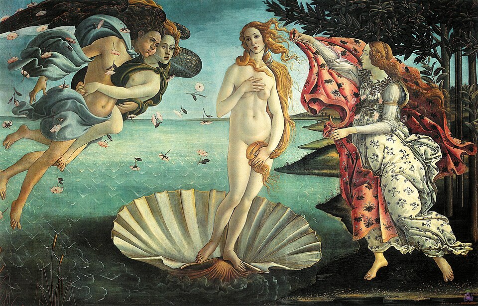
| Renaissance | Botticelli | Birth of Venus (1484–86) | Graceful figures, mythological serenity |
| Baroque | Caravaggio | Calling of Saint Matthew (1599–1600) | Tenebrism — spotlight from darkness, raw realism |
| Baroque | Rembrandt | Night Watch (1642) | Dramatic group lighting, movement frozen mid-action |
| Baroque | Peter Paul Rubens | Raising of the Cross (1610–11) | Muscular diagonal composition, emotional force |
| Baroque | Johannes Vermeer | Girl with a Pearl Earring (1665) | Intimate drama, precise tenebristic light |
Table 3: Technical Terminology Decoded
| Term | Period | What It Means |
|---|---|---|
| Sfumato | Renaissance | “To vanish like smoke.” Soft, hazy transitions between light and shadow, no hard edges. Leonardo’s signature. |
| Chiaroscuro | Both (different intensities) | “Light-dark.” The use of contrast between illuminated and shadowed areas to create volume. |
| Tenebrism | Baroque | Extreme chiaroscuro. Figures appear to emerge from near-total darkness, lit by a concentrated single source. |
| Linear perspective | Renaissance | Mathematical system for representing 3D space on a flat surface, pioneered in Florence in the early 1400s. |
| Foreshortening | Renaissance | Shortening lines in a drawing to create the illusion of depth for figures or objects pointing toward the viewer. |
| Contrapposto | Renaissance | A stance in which the figure shifts weight to one leg, creating a subtle twist in the torso — borrowed from ancient Greece. |
| Diagonal composition | Baroque | Placing the main visual energy along a diagonal axis rather than horizontal/vertical, creating a sense of instability and movement. |
The Full Breakdown
Where They Come From
I think the most useful way to understand the difference between Renaissance and Baroque is to start with why each existed, because both movements were essentially commissioned responses to political and religious crises.
The Renaissance began in Florence around the 14th century as a deliberate revival of classical Greek and Roman thought, philosophy, and aesthetics. The core intellectual engine was humanism — the idea that human beings are worthy of serious study, that reason matters, that the individual has dignity. Artists were deeply influenced by the Catholic Church, which was still the dominant cultural patron in Italy, but the Church’s appetite at this point was for images that conveyed order, wisdom, and divine beauty. The result was art built on harmony, ideal proportion, mathematical precision, and a view of the human form as something approaching the sacred.
The Baroque emerged from a rupture. The Protestant Reformation, launched formally in 1517, had split Western Christianity and dramatically weakened the authority of the Roman Catholic Church. The Church responded with the Counter-Reformation — a campaign to reassert Catholic identity and win back believers. Baroque art was a central weapon in that campaign. Where Renaissance art said “God’s world is beautiful and ordered,” Baroque art said “feel this, be moved by this, be overwhelmed.” The Church wanted art that created an emotional response so powerful it would pull people into devotion and keep them there.
This is the fundamental split between the two movements. Renaissance art is designed to be contemplated. Baroque art is designed to hit you.
Light: The Clearest Difference
If I had to explain the difference between Renaissance and Baroque to someone using only one word, it would be “light.”
In Renaissance painting, light is everywhere and uniform. It comes from no specific dramatic source. Figures are fully illuminated. The landscape background and the foreground figures exist in the same coherent light. Leonardo da Vinci’s sfumato technique — derived from the Italian for “to vanish like smoke” — created transitions between light and shadow so gradual and subtle that the eye cannot find an edge. The Mona Lisa has no hard lines. Nothing is sharply lit or sharply dark. Everything breathes.
Baroque painters, starting with Caravaggio in the late 1590s, inverted this entirely. Caravaggio developed tenebrism — a technique where figures are illuminated by a harsh, concentrated single light source and the surrounding environment plunges into near-total darkness. In The Calling of Saint Matthew, a beam of light cuts across an otherwise black scene like a theatre spotlight. The figures it catches are ordinary men at a table, rendered with brutal realism. The divine intrudes on the everyday, and you feel it physically.
Caravaggio developed tenebrism by using contrasts where a gesture or a figure was intensely illuminated as if by a spotlight in a dark setting. Baroque painters took Renaissance chiaroscuro — which was always a technique of suggestion — and turned it into a blunt instrument.
Composition: Order vs. Urgency
Renaissance compositions are architecturally organized. Horizontal and vertical lines dominate. Figures are arranged in triangles or pyramids that distribute visual weight evenly across the picture plane. Raphael’s School of Athens is a masterclass in this — dozens of figures arranged in a vast, perfectly symmetrical space, every element balanced against every other. The viewer knows exactly where to look and in what sequence.
Renaissance art and architecture relied on mathematically precise compositions which explored ideal harmony and the golden ratio, with horizontal and vertical lines key to achieving calm order and stability.
Baroque compositions are built on diagonals. The visual energy runs at an angle, which creates an inherent sense of instability and motion. Where Renaissance figures are composed and still — existing in a kind of eternal, ideal present — Baroque figures are caught in a specific instant. In Baroque sculpture and painting, the intersecting arcs give a sense of dynamism — we are in the dramatic throes of an instant of time, a pose that could not be maintained for more than a frozen fleeting fragment of a moment. The Baroque image implies time passing. The Renaissance image implies time stopped.
Subject and Figures: Ideal vs. Real
Renaissance figures are idealized. They have correct anatomy but perfect anatomy — no visible imperfection, no raw emotion that distorts the face, no sweat or strain that seems unseemly. Michelangelo’s figures on the Sistine Chapel ceiling are human beings elevated to something close to gods. Even in scenes of suffering, there is a dignity and composure that maintains the Renaissance belief in human potential and beauty.
Baroque figures are real. Caravaggio used street workers and prostitutes as models for his religious figures. His apostles have dirty fingernails. His saints look startled, afraid, uncertain. Baroque art subjects are portrayed with dramatic flair and imbued with emotion, energy, and a sense of direct engagement with the viewer — meant to inspire awe and often serving a propagandistic purpose, particularly in the context of the Counter-Reformation.
This is not an accident. The Church wanted ordinary people to recognize themselves in sacred images. A Madonna who looks like a real woman from the street is more emotionally persuasive to a common parishioner than an idealized heavenly figure she can never relate to.
Backgrounds: Setting vs. Void
In Renaissance painting, the background is a full participant in the composition. Leonardo’s Mona Lisa has a fully developed imaginary landscape behind the figure — misty mountains, a winding road, water, atmosphere. Raphael’s architectural interiors are as precisely rendered as his figures. The background anchors the image in a coherent world.
In Baroque painting, the background frequently disappears. Caravaggio’s figures often emerge from darkness so complete that no setting exists at all. The darkness is not a backdrop — it is the point. It removes context, removes orientation, and forces the viewer to confront the figures and their emotional state without any visual escape route.
How to Tell Them Apart in a Museum
I’ve developed a simple personal checklist when standing in front of an unfamiliar painting:
- Where is the light coming from? Everywhere softly = Renaissance. One harsh source from nowhere obvious = Baroque.
- Are the figures moving? Composed and still = Renaissance. Mid-gesture, mid-stride, mid-fall = Baroque.
- What is the background doing? Fully rendered world = Renaissance. Dissolving into darkness = Baroque.
- What do I feel? Calm, contemplative, ordered = Renaissance. Urgency, unease, awe = Baroque.
- Are there diagonals? Mostly horizontal and vertical structure = Renaissance. Strong diagonal axis = Baroque.
These are not rules that never break. Titian’s Venetian Renaissance work is more colorful and dynamic than Florentine Renaissance. Vermeer’s Baroque interiors are quieter than Caravaggio’s street scenes. But as a first-pass sorting system, this checklist works reliably.
Table 4: The One-Line Verdict on Each Major Difference
| Dimension | Renaissance in One Line | Baroque in One Line |
|---|---|---|
| Purpose | Show what is beautiful and true | Make you feel something right now |
| Light | Soft, everywhere, harmonious | Harsh, directional, theatrical |
| Figures | Idealized, still, dignified | Real, moving, emotional |
| Composition | Balanced, symmetrical, stable | Diagonal, asymmetrical, urgent |
| Background | Fully rendered, part of the world | Dark, receding, or absent |
| Religious function | Elevate and inspire through beauty | Persuade and overwhelm through feeling |
| Signature technique | Sfumato (Leonardo) | Tenebrism (Caravaggio) |
| What it asks of the viewer | Contemplate | React |
Final Thought
These two periods are not opposites so much as one conversation continuing across two centuries. While Baroque art turned away from aspects of Mannerism back to classical principles of the Renaissance, emphasizing anatomically correct figuration and convincing three-dimensional space, it did so in order to emphasize dramatic scenes, almost theatrical settings, and intense individualistic expression.
The Baroque did not erase the Renaissance. It took everything the Renaissance built — perspective, anatomy, chiaroscuro, narrative — and turned up the volume on every dial. If you find the Renaissance too calm and the Baroque too loud, the truth is they need each other. The order makes the drama meaningful. The drama makes the order worth breaking.